Data visualization personnalization
You can customize the display of the data during the acquisition, such as the evolution of the fluorescence intensity for example.
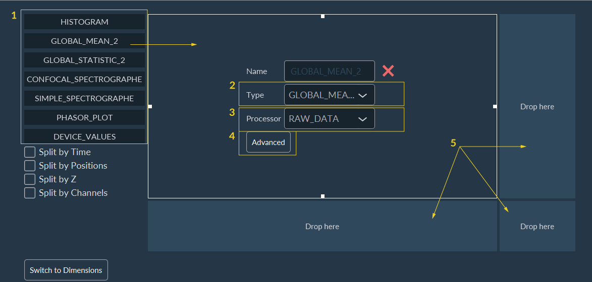
To customize the data visualization window:
-
Select a type of data to be displayed on the screen during acquisition:
- Histogram: element used to monitor the evolution of the intensity distribution.
- Global mean: element used to monitor the evolution of the average intensity of an acquisition sequence on a frame-by-frame basis or organized by a dedicated dimension.
- Global statistic: similar to “Global mean”, but have some statistical elements added directly in the graphics, giving a similar result to boxplots.
- Device values: element used to periodically retrieve information/values from devices, using "get" functions.
- Drag and drop it on the central square. The data type is resumed here. You can modify it using the drop-down menu.
- Select the data to consider for the visualization.
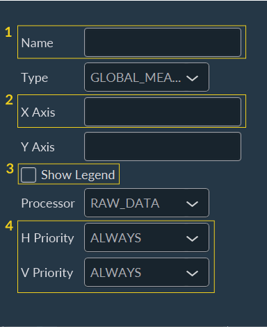
- Graphs can be customized to add some elements like the title of the axes or curves name.
- If you want to see more than one data during the acquisition. You have to repeat this procedure from the beginning by drag and drop a data type on another empty square.
- Add a name to the graph.
- Add a title to both X and Y axis.
- Select to see or hide the legend of each curve.
- Select “Always” to ensure that graphics will always be visible.
Note:
This customization step is optional, dedicated to helping
researchers interpret their results during acquisitions.